Your website is often the first—and sometimes only—touchpoint between your government agency or nonprofit and the people you serve. Whether someone is looking for emergency assistance, trying to donate to your cause, or searching for volunteer opportunities, your website needs to work. Not just aesthetically, but functionally, legally, and ethically.
Yet the reality is troubling: 87% of nonprofit websites need improvement on desktop performance, and only 22% of nonprofits have websites designed for accessibility. For government sites, the statistics aren’t much better—only 9% of government websites use plain language, and just 31% employ modern design standards.
This gap between what works and what most organizations deploy isn’t a coincidence. Government and nonprofit web design is fundamentally different from commercial web design. You’re not just trying to sell a product; you’re building trust, ensuring legal compliance, removing barriers to access, and guiding people toward meaningful actions—whether that’s finding critical services, making a donation, or volunteering their time.
This guide walks you through everything you need to know about designing a government or nonprofit website that actually serves your mission. We’ll cover accessibility standards, conversion-driven UX, common pitfalls, and practical implementation strategies that work within budget constraints.
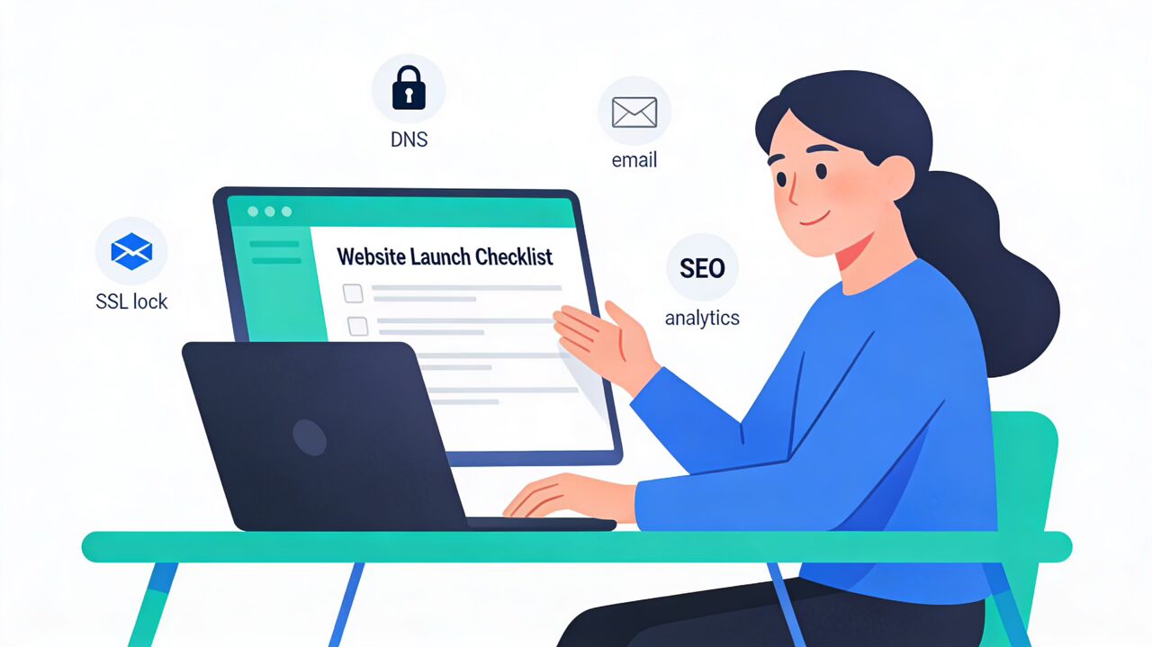
We follow an in-depth launch checklist to make sure our website launches go smoothly, if you’re interested in a professional website design and you don’t want to be in DIY hell anymore, get in touch with our team!
Why Professional Web Design Matters in Government and Nonprofit Sectors
The Trust Problem
94% of people say their first impression of an organization is based on its website design. For nonprofits and government agencies, this matters more than most realize. A person visiting your site is often vulnerable—they may be:
- Seeking emergency assistance or social services
- Making a financial decision to support your cause
- Evaluating whether to volunteer their precious time
- Checking if your organization is legitimate and trustworthy
A poorly designed website signals incompetence, inattention, or worse—that you don’t care about serving your audience. A professional, thoughtfully-designed website says the opposite: you’re serious about your mission, you respect your users, and you’re worth their support.
The Legal Reality
Unlike commercial websites, government and nonprofit websites operate under explicit legal obligations. Federal government websites must comply with Section 508 of the Rehabilitation Act, which requires digital accessibility. Many nonprofits that receive federal funding must comply with the Americans with Disabilities Act (ADA) Title II, which mandates website accessibility.
Even nonprofits not receiving government funding face increasing liability. Recent lawsuits have targeted organizations like Girl Scouts of America for inaccessible websites. Courts are increasingly interpreting the ADA to apply to all nonprofit websites. Non-compliance can result in costly lawsuits, reputational damage, and the exclusion of people who could benefit from your services.
Accessibility as Mission Alignment
Beyond legal requirements, accessibility is a values issue. If your nonprofit serves the homeless, elderly, low-income families, or people with disabilities, yet your website is inaccessible to those same populations, you’ve failed your core mission.
Accessible design benefits everyone, not just people with disabilities. Plain language helps non-native English speakers. Keyboard navigation helps people in noisy environments or those without a mouse. Captions benefit people watching videos without audio. Mobile optimization serves the 53% of nonprofit website traffic coming from phones.
Design accessibility isn’t a box to check—it’s the foundation of inclusive service delivery.
Understanding WCAG 2.2 and ADA Compliance Standards
What Is WCAG? (Web Content Accessibility Guidelines)
WCAG is the international standard for web accessibility, maintained by the World Wide Web Consortium (W3C). The latest version, WCAG 2.2, provides detailed guidelines for making web content accessible to people with disabilities.
WCAG uses three conformance levels:
- Level A: Basic accessibility (minimum priority considerations)
- Level AA: Widely accepted legal standard that most government and ADA-covered organizations target
- Level AAA: Highest level of accessibility (rarely required, most stringent)
For most government agencies and nonprofits, Level AA compliance is the target.
The Four WCAG Principles: POUR
WCAG 2.2 is built on four foundational principles, remembered by the acronym POUR:

Perceivable: Information and interface components must be perceivable to users. This means providing text alternatives for images (alt text), captions for videos, sufficient color contrast, and resizable text.
Operable: All functionality must be available from a keyboard. Users should be able to navigate, skip repetitive content, and interact with all elements without a mouse. This is critical for people with mobility disabilities and anyone using assistive technology.
Understandable: Text must be clear and readable, instructions must be obvious, and users should be able to predict how your site works. Consistent navigation and proper heading structure go here.
Robust: Content must work with assistive technologies today and in the future. This means using semantic HTML, proper markup, and avoiding deprecated code that screen readers can’t interpret.
Why Level AA, Not Level A?
Level A is too basic for most organizations. It allows for insufficient color contrast and missing captions, for example. Level AA addresses the most common accessibility barriers without becoming impractically difficult to implement.
Legal Requirements by Organization Type
Federal Government Agencies: Required to comply with Section 508 (which aligns with WCAG 2.1 AA standards). Failure to comply can result in agency-wide mandates and budget implications.
Nonprofits Receiving Federal Funding: Must comply with ADA Title II and align with WCAG 2.1/2.2 AA. Non-compliance documented through accessibility complaints can trigger audits and enforcement actions.
All Other Nonprofits: While not legally required under current federal guidelines, WCAG 2.2 AA compliance is highly recommended. Recent litigation shows courts are expanding ADA interpretations to cover nonprofit websites broadly. Proactive compliance avoids costly lawsuits and protects reputation.
The Seven Critical Elements of Accessible Web Design
1. Color Contrast and Visual Clarity

Text must have sufficient contrast against its background to be readable. WCAG 2.2 AA requires:
- Normal text (14px and smaller): 4.5:1 contrast ratio
- Large text (18px and above): 3:1 contrast ratio
- Graphical elements: 3:1 contrast ratio
To put this in perspective, black text on white is 21:1 (well above requirement). Light gray on white is roughly 2.5:1 (fails AA).
Practical implementation: Use contrast checkers like WebAIM, Color Contrast Analyzer, or built-in browser developer tools. Test your color palette before design systems are locked in. This prevents expensive redesigns later.
2. Alt Text for Images and Visual Content
Every meaningful image needs descriptive alt text that conveys its purpose and content. Alt text should:
- Describe the image clearly and concisely (usually 125 characters or less)
- Avoid phrases like “image of” or “picture of” (screen readers announce this automatically)
- For complex graphics, use longer descriptions or link to detailed explanations
- For decorative images, use empty alt attributes (alt=””) so screen readers skip them
Example alt text for a nonprofit impact photo:
- ❌ Bad: “Group of people”
- ✅ Good: “Local volunteer team distributing meals at community food bank”
3. Keyboard Navigation and Focus Management
Every interactive element—links, buttons, form fields—must be accessible via keyboard alone. This includes:
- Tab order: Users should navigate through interactive elements in logical order
- Visible focus indicators: When focused, elements must have a visible outline or highlight (never remove it with CSS)
- Skip navigation links: Place a “Skip to main content” link at the very top of every page, hidden by default but visible when focused, so keyboard users don’t have to tab through your entire navigation menu
4. Semantic HTML and Proper Heading Structure
Use HTML correctly. This means:
- Use <h1>, <h2>, <h3> for headings in logical, hierarchical order (don’t skip levels)
- Use <button> for buttons, <a> for links, <label> for form fields
- Use semantic elements like <nav>, <main>, <article>, <footer> to structure content
- Use lists (<ul>, <ol>) for actual lists, not just visual styling
Screen readers use this structure to navigate documents. When you use <div> and <span> for everything, screen readers have no idea how to interpret your content.
5. Accessible Forms and Error Handling
Forms are where conversions happen—donations, volunteer signups, service requests. They must be accessible:
- Label every field: Use <label> elements that are programmatically linked to form inputs
- Error messages in text: If validation fails, describe the error in plain text near the field, not just in red color
- No time limits: Users with cognitive disabilities or slow internet shouldn’t be logged out or lose data
- Required field indicators: Clearly mark which fields are required, using text (not just an asterisk)
6. Video and Audio Content with Captions and Transcripts
Impact videos are powerful for nonprofits, but they must be accessible:
- Captions: All videos need captions for dialogue and important sounds (e.g., “[phone ringing]”)
- Audio descriptions: For complex visual content, provide descriptions of what’s happening on screen
- Transcripts: Provide full transcripts for podcasts and audio content
- User controls: Allow users to pause, adjust volume, and control playback speed
7. Mobile Accessibility and Responsive Design
53% of nonprofit website traffic comes from mobile devices, yet 67% of nonprofit sites have poor mobile performance. Mobile accessibility means:
- Touch targets: Buttons and links must be large enough to tap accurately (minimum 44×44 pixels)
- Readable text without zooming: Users should read content without having to zoom in
- Responsive layout: Content reflows at different screen sizes without losing functionality
- No mobile-only content: Don’t hide important information on mobile; reorganize it instead

Designing for Your Mission: Nonprofit-Specific Best Practices
Understanding Your Audience and Their Goals
Before designing, understand who visits your site and why. Create user personas:
- Potential donors: What questions do they have before giving? How much information do they need to trust you?
- Volunteers: Are they looking for one-time events or ongoing commitments? How much application process will they tolerate?
- Service seekers: Are they in crisis? Do they speak English as a first language? What devices do they have?
- Community members: Do they want to learn about your mission, or are they looking for resources?
Different visitors have different needs. A person in crisis seeking emergency assistance has zero patience for navigation complexity. A major donor might spend 10 minutes researching your organization. Design with all of them in mind.
Building Trust Through Design
Government and nonprofit websites must signal trustworthiness immediately:
Show Impact Through Numbers: “Provided meals to 50,000 people last year” is more compelling than “Fights hunger.” Use real metrics. If you don’t track impact, start.
Publish Real Stories: Showcase actual beneficiaries (with permission) in photos and videos, not stock photos of dramatically smiling strangers.
Display Security and Privacy: Show your SSL certificate (HTTPS), privacy policy, and security practices. For nonprofits, display your 501(c)(3) status, registration with charity watchdogs (GiveWell, Charity Navigator), and financial transparency reports.
Use Consistent Branding: A polished, consistent visual identity signals professionalism. This includes consistent fonts, color palette, logo placement, and imagery style.
Include Clear Contact Information: Don’t hide how people can reach you. A phone number, email, and physical address (if applicable) build trust that you’re real and accountable.
Conversion-Focused CTAs for Nonprofits
Clear calls to action drive conversions—donations, volunteer signups, newsletter subscriptions. Yet many nonprofit websites bury these CTAs or make them weak.
Best practices for nonprofit CTAs:
- Place prominently: “Donate Now” button should be visible above the fold on the homepage, and again on every program/impact page
- Use action verbs: “Donate Now,” “Join Us,” “Volunteer Today” are stronger than “Submit” or “Click Here”
- One primary CTA per page: Don’t overwhelm visitors with multiple options. Choose whether this page’s primary goal is donations, volunteerism, or information, then design around that
- Explain impact directly: Next to your CTA, answer “What does this do?” Show that a $25 donation provides meals for a week, or a 4-hour volunteer shift helps 10 families
- Make donation amounts easy: Offer preset amounts ($10, $25, $50, $100) with a custom field option. This reduces decision fatigue and actually increases donation sizes
- Simplify the form: Every additional field reduces conversion. Ask only for name, email, and payment method on the first step. Gather additional information after the donation is complete
Mobile-First Donation Experience
Desktop users make up 70% of donation revenue, but mobile users represent 53% of traffic. The mobile donation experience is critical:
- Keep donation forms to 5 fields maximum
- Use large, easy-to-tap buttons (44×44 pixels minimum)
- Auto-detect phone numbers and emails on mobile
- Test payment processing on phones and tablets
- Ensure the thank-you page displays properly on small screens
The average mobile donation is $76 versus $145 on desktop. While lower, every optimization matters when you’re depending on online revenue.
Storytelling and Emotional Connection
Impact stories are the most powerful tool nonprofits have. They transform statistics into human reality.
How to structure impact stories on your website:
- The Challenge: Introduce a real person and their problem (be specific and authentic)
- The Solution: Show how your organization helped
- The Outcome: What changed? Use metrics when possible (“Sarah now has stable housing and a part-time job”)
- The Call to Action: Make the next step obvious—donate to help more people like Sarah, or volunteer to provide similar support
Use real photos and names (with permission) rather than stock photography. Donors connect with real people, not models.
Government Website Requirements: Beyond Nonprofit Standards
Government websites have unique requirements that go beyond accessibility and trust-building:
Information Architecture and Plain Language
Government websites often serve diverse audiences with varying literacy levels and language proficiency. This demands exceptionally clear organization and language:
- Plain language: The average government website uses complex sentences and jargon. Use short sentences, common words, and active voice. Explain acronyms on first use.
- Logical information hierarchy: Organize by user task, not by organizational structure. If someone is trying to apply for a benefit, group all benefit application pages together, even if they’re handled by different departments
- Search-first design: Many government websites are so complex that search is the primary navigation method. Make sure your site search is excellent
- Mobile optimization as priority: Government services must be accessible to people with older phones and slower internet. Design mobile-first, then expand to desktop
Section 508 and Federal Accessibility Standards
Federal government websites must comply with Section 508 of the Rehabilitation Act, which requires websites to meet WCAG 2.1 AA standards. Section 508 was recently updated to reference WCAG 2.2 AA.
Key Section 508 requirements:
- All web pages must be perceivable, operable, understandable, and robust
- Provide alternative text for images
- Use proper semantic HTML structure
- Ensure keyboard accessibility
- Provide captions and transcripts for multimedia
- Make sure interactive elements have sufficient contrast
The U.S. Web Design System (USWDS)
The U.S. government provides USWDS (digital.gov), a centralized design system and component library specifically built for federal websites. It includes:
- Pre-built components (buttons, forms, navigation) that meet Section 508 requirements
- A consistent visual identity that identifies sites as government (.gov identity)
- Pre-tested patterns for common government tasks
- Extensive documentation and accessibility guidance
If you’re building a government website, USWDS is worth implementing. It reduces the risk of accessibility failures and creates consistency across agencies.
Public Service Orientation
Government websites aren’t about marketing—they’re about serving the public efficiently. This demands:
- Findability over sales: A government website’s primary goal is people finding the information or service they need quickly
- Multi-language support: If your area has significant non-English-speaking populations, provide content in those languages (not just translation buttons)
- Offline alternatives: Not everyone has internet access. Provide phone numbers and office hours. Make sure PDFs are downloadable and accessible
- Regular content updates: Outdated information undermines trust and creates legal liability. Establish a content maintenance schedule
Common Design Mistakes Government and Nonprofit Websites Make
Mistake #1: Ignoring Accessibility Until Too Late
Many organizations treat accessibility as an afterthought—something to audit and fix after launch. This is expensive and often ineffective.
Better approach: Build accessibility into the design from day one. It’s cheaper to make decisions with accessibility in mind than to retrofit a broken website.
Mistake #2: Poor Information Architecture
Many nonprofit and government websites organize content by internal department structure, not by how users think. A visitor looking for “How do I apply for this program?” shouldn’t have to navigate three different departments.
Better approach: Use card sorting with real users to understand how they categorize information. Organize by task and user journey, not organizational structure.
Mistake #3: Weak or Missing Calls to Action
Websites that fail to convert visitors often have vague CTAs. “Learn More” or “Submit” don’t inspire action. Visitors should know exactly what happens next.
Better approach: Use specific, benefit-driven language. “Donate $25 to Provide Books for 10 Kids” is stronger than “Make a Donation.”
Mistake #4: Overloading Pages with Information
Many government and nonprofit sites cram too much content on every page, hoping to “cover everything.” The result is cognitive overload. Visitors bounce without taking action.
Better approach: Use progressive disclosure. Show essential information first, then provide links to detailed content. Let users choose their depth of engagement.
Mistake #5: Slow Page Load Times
25% of website visitors abandon a site if it takes more than 4 seconds to load. For nonprofits trying to convert donors, slow sites are literally losing money.
Common culprits:
- Oversized, unoptimized images (compress to 50KB-200KB for web)
- Too many scripts and plugins
- Poor hosting that can’t handle traffic spikes
- Render-blocking CSS and JavaScript
- No caching strategy
Better approach: Use Google PageSpeed Insights and GTmetrix to identify issues. Prioritize image optimization and lazy loading. Use a content delivery network (CDN) to serve assets faster.
Mistake #6: Not Optimizing for Mobile
53% of nonprofit traffic is mobile, yet many sites are still optimized for desktop first. Visitors on phones experience:
- Text too small to read
- Buttons too small to tap
- Slow performance
- Donation forms that don’t work on mobile
Better approach: Design mobile-first. Start with the phone experience, then expand to desktop. Test on real devices, not just browser emulation.
Mistake #7: Inconsistent Branding and Visual Design
Many nonprofit websites use different fonts, colors, and layouts across pages. This signals inconsistency and reduces trust.
Better approach: Create a style guide that covers:
- Primary and secondary colors (and their hex codes)
- Font families (limit to 1-2 typefaces)
- Heading hierarchy (what size and style is H1 vs. H2)
- Button styles and hover states
- Whitespace and spacing rules
- Imagery style (photography vs. illustration, color treatment)
- Logo usage guidelines
Enforce this guide across all pages.
Mistake #8: Donation Forms That Ask for Too Much
Every form field you ask for reduces conversions. A form asking for name, address, phone, email, custom donation amount, and donor type will convert far fewer people than a form asking for just name, email, and amount.
Better approach: Collect only essential information at the moment of giving (name, email, payment details). Gather additional information post-donation through thank-you surveys, or skip it entirely if you don’t really need it.

Building a High-Converting Nonprofit Website: The Devbo Approach
At Devbo, we build nonprofit and government websites with a specific philosophy: clean design + obsessive accessibility + conversion-first UX = mission impact.
Our Process
Discovery & Strategy We spend time understanding your mission, your audience, and your goals before designing anything. What percentage of revenue comes from online donations? Who are your biggest volunteer demographics? What questions do first-time donors have?
Information Architecture & User Flows We organize content based on how your real users navigate, using techniques like tree testing and card sorting. We map user journeys for each audience—donors, volunteers, community members—and design pathways that make sense.
Design for Accessibility from Day One We build WCAG 2.2 AA compliance into the design system, not as a retrofit. This means:
- Choosing color palettes that meet contrast requirements
- Designing touch targets that are large enough for everyone
- Using semantic HTML structure from the start
- Testing with assistive technologies during design
Performance-First Development Slow sites lose donors and volunteers. We:
- Optimize images ruthlessly (compression, formats, lazy loading)
- Minimize JavaScript and CSS
- Leverage browser caching
- Use CDNs to serve content globally
- Test on real devices and slower internet connections
Conversion Rate Optimization Small changes create big differences. We:
- A/B test CTA button text, color, and placement
- Simplify donation forms ruthlessly
- Optimize thank-you pages for repeat giving
- Implement email capture for newsletter growth
- Track user behavior with analytics to identify friction points
Ongoing Support and Compliance Websites aren’t fire-and-forget. We provide:
- Regular accessibility audits
- Content updates and maintenance
- Performance monitoring
- Security patches and updates
- Training so your team can manage the site
Case Study: Local Animal Shelter
One nonprofit we worked with had a beautiful website but was converting only 0.8% of visitors to donors. After auditing, we found:
- Donation button was below the fold on the homepage
- Form asked for 12 pieces of information
- No impact stories or statistics showing where money goes
- Slow performance (8-second load time)
Changes we made:
- Moved “Donate Now” button above the fold
- Reduced form to 4 fields
- Added impact section: “Your $50 feeds a rescue dog for a month”
- Optimized images and minified code (2-second load time)
- Created new program pages with impact stories
Results: Conversion rate improved to 2.1%—a 163% increase in donations without increasing traffic.

Choosing the Right Platform: WordPress vs. Drupal for Nonprofits
The most popular platforms for nonprofit websites are WordPress and Drupal. Which is right for you?
| Aspect | WordPress | Drupal |
|---|---|---|
| Learning Curve | Easy for non-technical users | Steep; requires developers |
| Cost | Free (but hosting/support needed) | Free (but hosting/support needed) |
| Plugins/Extensions | Hundreds available; easy to install | Modules available; more setup required |
| Security | Good; requires regular updates | Excellent; strong access controls |
| Scalability | Good for small to medium orgs | Excellent for large, complex organizations |
| Accessibility | Good (varies by theme) | Excellent built-in support |
| Community Support | Massive; lots of tutorials | Smaller but expert community |
| Best For | Single-chapter orgs, limited IT | Multi-chapter organizations, federal sites |
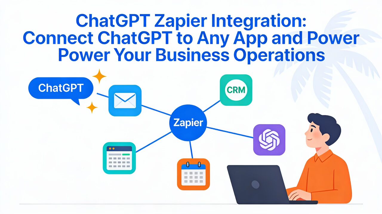
WordPress is the choice for most nonprofits. It powers 60% of nonprofit websites. It’s affordable, flexible, and has a massive ecosystem of plugins for donations (GiveWP), volunteer management (VolunteerHub), and CRM integration (Zapier).
Drupal dominates among top 100 nonprofits by traffic (46% usage vs. 26% for WordPress). Large organizations like the American Red Cross and humanitarian NGOs choose Drupal for its robustness, security, and ability to handle complex data workflows.
If you have IT staff or a technical partner agency, Drupal is powerful. If you’re a small to mid-size nonprofit without technical depth, WordPress is the practical choice.

Accessibility Checklist: Your Path to WCAG 2.2 AA Compliance
Here’s a actionable checklist to guide your accessibility journey:
Design Phase
- Choose colors with sufficient contrast (4.5:1 minimum for normal text)
- Design buttons and links large enough to tap (44×44 pixels minimum)
- Plan heading hierarchy (H1 → H2 → H3 in logical order)
- Identify where alt text is needed (meaningful images, not decorative)
Development Phase
- Use semantic HTML (<button>, <nav>, <main>, etc.)
- Add alt text to all meaningful images
- Test with keyboard navigation only (no mouse)
- Test with screen readers (NVDA, JAWS, VoiceOver)
- Implement “Skip to main content” link
- Ensure all form fields have labels
Content Phase
- Write in plain language (8th-grade reading level or lower)
- Use short sentences and paragraphs
- Explain acronyms on first use
- Provide captions and transcripts for videos
- Include alt text for all images and graphics
Testing Phase
- Use automated tools (WAVE, Lighthouse, Axe)
- Manually test with keyboard navigation
- Test with multiple screen readers
- Test on real devices at different screen sizes
- Zoom to 200% and verify layout adapts
- Test with color-blind vision simulators
- Have someone with actual disabilities test your site
Documentation and Maintenance
- Create an accessibility statement
- Establish a schedule for regular testing (quarterly at minimum)
- Document known issues and remediation plans
- Train staff on accessibility best practices
- Include accessibility requirements in vendor contracts
Frequently Asked Questions
How much does an accessible nonprofit website cost?
Basic website design ranges from $6,500 to $15,000. Adding robust accessibility planning, testing, and compliance might add 15-25% to the cost. However, the cost of defending an accessibility lawsuit is far higher—often $25,000-$100,000+ in legal fees alone.
Accessible design done right shouldn’t be a massive cost adder if accessibility is considered from the start. Retrofitting an inaccessible site is expensive; building it right from day one is reasonable.
Can I make my existing nonprofit website accessible?
Yes, but it’s more expensive than building it right initially. Start with an accessibility audit to identify specific issues. Prioritize fixes by impact (how many people are affected?) and effort. Fix keyboard navigation and contrast first; these affect large portions of the disabled population and are usually quick wins.
Is WordPress secure enough for nonprofit websites?
Yes, WordPress is secure if properly maintained. This means:
- Keep WordPress, themes, and plugins updated
- Use strong passwords and two-factor authentication
- Use security plugins (Wordfence, iThemes Security)
- Use reputable hosting with regular backups
- Perform regular security audits
Drupal is slightly more secure out of the box, but poorly maintained WordPress is more secure than neglected Drupal.
How do I know if my website is ADA compliant?
There’s no official “compliance certificate.” Instead, test using:
- Automated tools (Lighthouse, WAVE, Axe)
- Manual testing with keyboard and screen reader
- Testing with real assistive technology users
- Getting an accessibility audit from a professional
Aim for WCAG 2.2 AA compliance. If you meet those standards, you’re doing well. Document your testing process in case you’re ever questioned.
What’s the difference between ADA compliance and WCAG compliance?
WCAG (Web Content Accessibility Guidelines) is the technical standard that defines how to make websites accessible. ADA (Americans with Disabilities Act) is U.S. law that requires websites to be accessible. Courts have interpreted ADA to require WCAG 2.1 AA compliance as the baseline.
WCAG 2.2 is the latest version; WCAG 2.1 is also acceptable. When in doubt, build to WCAG 2.2 AA.
Should nonprofits use website builders like Wix or Squarespace?
Website builders are okay for very small nonprofits with minimal needs. Pros: easy to use, fast to launch, affordable. Cons: limited customization, harder to integrate with donor management software, less control over accessibility and performance.
WordPress (with a good theme and plugins) usually offers better value for growing nonprofits. Drupal for larger organizations needing robust functionality.
How do I optimize my nonprofit website for Google search?
Basic nonprofit SEO includes:
- Target relevant keywords: “Volunteer [city]” or “[cause] nonprofit [city]”
- Build backlinks: Get mentioned on local directories, city websites, partner sites
- Create original content: Write blog posts about your work and impact
- Optimize for local search: Complete your Google Business Profile, ensure your address and phone are consistent
- Use structured data: Add schema markup so Google understands your organization
- Build topical authority: Create comprehensive content clusters around key topics (e.g., “How to Volunteer,” “Volunteer Stories,” “Volunteer FAQ”)
Local SEO is especially valuable for nonprofits, as many people search “[service] + [city].”
What should I do if I’m sued for website accessibility?
First: contact your insurance provider and a lawyer experienced in ADA litigation. Don’t ignore it. Most settlements are negotiated.
Then: fix the accessibility issues quickly. Courts are more lenient if you’re proactively addressing problems. Document all remediation efforts.
Long-term: invest in genuine accessibility compliance. Litigation is expensive and time-consuming.
Building Topical Authority: Blog Content Strategy for Government and Nonprofit Websites
Blogging builds search visibility and trust. For government and nonprofits, effective blog strategies focus on the questions your audience actually has:
For nonprofits, consider topics like:
- “How to Get Involved” (multiple volunteer articles)
- “Understanding [Your Cause]” (educational content)
- “Success Stories” (impact documentation)
- “Expert Advice” (interviews with staff or board members)
- “How to Help” (donation guides, easy giving methods)
For government agencies, consider:
- “How to Apply for [Benefit]” (step-by-step guides)
- “Services Available” (comprehensive program overviews)
- “Frequently Asked Questions” (answering constituent questions)
- “Announcements and Policy Updates” (keeping public informed)
Each blog post should:
- Target 1-2 specific keywords
- Be 1,500-2,500 words (searchable length)
- Include internal links to relevant pages
- Have a clear CTA (donate, volunteer, sign up)
- Be optimized for mobile
- Include at least one relevant image or media
Cluster these articles thematically so Google understands you’re an authority on that topic.
Your Action Plan: Getting Started
Month 1: Audit and Planning
- Conduct an accessibility audit (automated + manual testing)
- Analyze your current website’s conversion performance
- Survey users about their experience
- Research your audience (who visits, what they want)
Month 2: Strategy and Design
- Create or update information architecture based on user research
- Design wireframes with accessibility in mind
- Choose your platform (WordPress or Drupal)
- Select plugins and integrations (donation tools, email capture, analytics)
Month 3: Development and Testing
- Build pages and functionality
- Implement accessibility features (alt text, semantic HTML, keyboard navigation)
- Test extensively (keyboard, screen reader, mobile, performance)
- Perform accessibility audit before launch
Month 4: Launch and Optimization
- Go live with your new website
- Monitor performance and user behavior
- A/B test CTAs and donation forms
- Train staff on website management
- Create ongoing maintenance and update schedule
Conclusion: Why This Matters
Your nonprofit or government website isn’t a vanity project. It’s the primary touchpoint between your mission and the people you serve. A thoughtfully designed, accessible, conversion-focused website:
- Includes people by meeting accessibility standards
- Builds trust through professional design and transparent communication
- Drives action through clear CTAs and friction-free processes
- Respects users’ time by organizing information logically
- Multiplies your impact by making it easy for people to support your cause
The organizations that will thrive in 2025 and beyond are those that treat their websites as strategic assets, not afterthoughts. Every dollar spent on professional web design returns multiples through increased donations, volunteers, and public service delivery.
Your mission matters. Your website should too.
FAQs: Quick Reference Guide
Q: What is WCAG 2.2, and why does my nonprofit need it?
A: WCAG 2.2 is the Web Content Accessibility Guidelines—the international standard for making websites accessible to people with disabilities. Nonprofits receiving federal funding must comply, and courts increasingly hold all nonprofits to these standards. It’s both legally smart and ethically right.
Q: How much will accessibility improvements cost?
A: Accessibility built into initial design adds minimal cost. Retrofitting an existing site costs 15-30% of your build budget. A lawsuit costs far more.
Q: Which is better for nonprofits: WordPress or Drupal?
A: WordPress for small to mid-size nonprofits (easy, affordable, great plugins). Drupal for large organizations needing robust security and complex data management.
Q: How long does it take to make a website WCAG compliant?
A: A small website: 2-4 weeks. A large one: 2-3 months. Requires design updates, content work, and thorough testing.
Q: Can I use website builders like Wix for my nonprofit?
A: Yes, but WordPress usually offers better long-term value, integrations, and customization. Website builders are fine for very small organizations.
Q: What should my nonprofit’s homepage include?
A: Mission statement, impact stats, clear CTAs (donate/volunteer/learn), a success story, security/trust signals (nonprofit status, funding info), and easy navigation.
Q: How do I convince my board that accessibility is worth the investment?
A: Explain legal liability, mission alignment (can you truly serve people with disabilities if your site excludes them?), and that accessibility improves UX for everyone—especially on mobile.
Q: How often should I audit my website for accessibility?
A: Quarterly at minimum. Every 6 months if you’re actively adding new content and features.